
|
|
|
|
From
Policy
Implications from Comparing Traffic Fatality Trends Thru 2011 in 26 Countries (or
The Dramatic Failure of US Safety Policy Revisited), In
P.Brieler
and K Püschel (eds), Safe Mobility on Land. Sea and in the Air,
Proceedings of the 23rd World Congress of
International Traffic Medicine Association (ITMA), Hamburg, Germany 19-22 May 2013.
Verlag Dr. Kovac, Hamburg, 2014, p.
17-32
This
paper provides more detailled technical background (11 Figures, 4
Tables) to the later Research
Paper (3 Figures and 1 Table) in the
American Journal of Public
Health. Still,
Best to cite as this more accessible source: "Leonard
Evans. Traffic Fatality Reductions: United States Compared With 25 Other
Countries.
American
Journal of Public Health:
August 2014, Vol. 104, No. 8, pp. 1501-1507".
The
Editorial in the
American Journal of Public
Health flows from this same paper.
Policy Implications from Comparing Traffic Fatality Trends Thru 2011 in 26 Countries
(or
The Dramatic Failure of US Safety Policy Revisited)
Leonard Evans
Keywords. Traffic fatalities, traffic safety, trafic crashes, trraffic accidents, safety policy, international comparisons, safety measures
ABSTRACT
Objective: Based on comparing US performance with that in three comparison countries, the author previously concluded that disastrous US policy was, in 2002, killing more than ten thousand additional Americans every year. This paper aims to answer three questions. 1) Do earlier conclusions based on data through 2002 persist? 2) Are earlier claims that three comparison countries were not “special” validated by other countries? 3) Are conclusions now validated with even more clarity and confidence?
Materials and Methods: An effective measure to compare safety in different countries is current traffic deaths relative to the maximum number experienced. This, and other, measures were examined using data for 26 countries in the International Road Traffic and Accident Database (IRTAD).
Results: The answers to the three questions is in all cases a definitive 'yes'. The fatality rates examined all declined in the US over the last four decades. However, they declined more rapidly in each of the other 25 countries, in most cases far more rapidly. In terms of declines after reaching a maximum number of fatalities, the US is a unique outlier. All 25 other countries declined further, or faster. The US was the safest country in the world in the 1970s. By 2011 the US dropped from number one to number 18 in terms of driver fatalities per thousand registered vehicles, and from number one to number 13 in terms of driver fatalities per billion km of vehicle travel.
Conclusions: The catastrophic failure of US traffic safety policy is of almost incomprehensible magnitude. If US fatalities had declined by the same percent as happened in any one of seven other countries, more than 20,000 fewer Americans would have died on US roads in 2011.
INTRODUCTION
The launching pad for this paper is Chapter 15 of the author's 2004 book Traffic Safety[1]. This chapter, titled The Dramatic Failure of US Safety Policy, was called the showstopper in one of the reviews[2].
US safety policy was examined relative to that in three comparison countries. These were Great Britain, Canada, and Australia, chosen because they have much in common with the US in terms of language, beliefs, and traditions. Performance was compared over the 23-year period from 1979 to 2002. When Traffic Safety[1] was written the latest available data, in some cases provisional, was for 2002. It was in the late 1970s/early 1980s that safety policies of countries outside the US began to diverge from that in the US. A main focus of this paper is to further compare US safety performance with that in other countries and to make policy inferences from the comparison.
Figure
1 is a reproduction from the 2004 book[1] which shows that in the period 1979 to
2002 fatalities in the US had declined by 16% (from 51,093 in 1979 to 42,815 in
2002). Taken in isolation this might look like impressive progress. Indeed, such
reductions were heralded by US officials as proving policies were working.
However, when the US 16% reduction was compared to the average reduction of more
than 50% in the three comparison countries, an entirely different conclusion was
unavoidable.
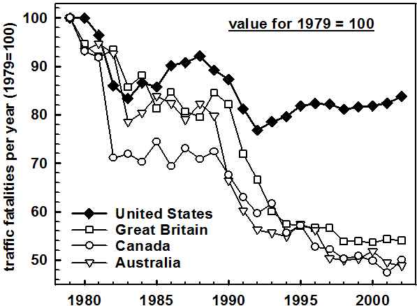
The raw fatality comparison in Figure 1 is just one of three measures examined[1]. The other two were the number of fatalities per thousand vehicles and (when available) the number of fatalities for the same distance of travel. In all cases the results of the comparisons were similar. US performance was dramatically worse than in the comparison countries.
If the US fatalities had declined by the same percent as in the comparison countries more than 16 thousand fewer people would have been killed on American roads in the single year of 2002. Adding the difference for each year led to the conclusion that about 200,000 additional Americans had died in the period 1979-2002 because of the failure of the US to match the declines in the comparison countries[1].
One of the most common questions from US audiences is to these comparisons is "What is so special about the comparison countries that they do so enormously better than the USA." The questioner is often taken aback by my reply that there is nothing special about them – it is the USA that is special – it is the USA that has aberrant safety policies.
Notwithstanding this response, the question still remains that the three comparison countries could have been especially successful at reducing fatalities, and that this is the source of the difference. Perhaps the US has made unusual progress since 2002, thereby reducing some of the large difference so apparent in Fig. 1.
This paper accordingly addresses three questions.
1. Do earlier conclusions based on data through 2002 persist?
2. Are earlier claims that three comparison countries were not “special” validated by other countries?
3. Are conclusions now validated with even more clarity and confidence?
METHODS AND MATERIALS
The data used for Fig. 1 was obtained from each of the responsible jurisdictions Great Britain[3], Canada[4], and Australia[5]. This paper uses data from the International Road Traffic Accident Database (IRTAD)[6] which collects values for a number of measures for 32 jurisdictions. The data used in this study[7] were kindly provided through the courtesy of IRTAD[6].
This paper focuses exclusively on fatalities. Fatalities, the highest level of harm from a traffic crash, provide the most reliable data. However, even this most reliable measure is often less reliable than it might seem, and for a number of reasons. First, the technical difficulty of including all the cases, and only those cases, that fit a clear definition of what a traffic fatality is. For example it is sometimes defined as death within 30 days of the crash as a result of the crash. As everyone has some probability of dying at any moment, some will die 30 days after a crash for reasons that have nothing to do with the crash. More importantly, the same government agencies and officials responsible for reducing traffic deaths are often the very ones collecting and analyzing the data, which can lead to biases[8]. With these caveats we accept the reported data as reflecting the actual number of traffic deaths.
The IRTAD[6] data contains fatality and other data for 32 jurisdictions. These include the United Kingdom (UK), Great Britain (GB), and Northern Ireland (NI); these had fatalities in 2011 equal to 1960, 1902, and 59, respectively. As UK = GB + NI, no more than one of these can be included. It would be preferable to use the UK data because it is for the entire nation, and sample sizes are a few percent larger. However, to provide a better comparison with Fig. 1 and to be compatible with the earlier discussion and analyses[1], and nearly all prior studies of British safety, we analyze the data for GB.
From the 29 remaining countries we exclude Slovakia because there are too many missing values, and Iceland (with 12 fatalities in 2011) and Slovenia (with 141) because there are too few data.
A selection of the data for the remaining 26 countries is presented in Table 1, in which some years' data are not printed because of space constraints. All the analyses in this report are based on fatality data for these 26 countries, in some cases the data going back to the mid 1960s. A main focus of the paper is to compare US safety performance with that in the other 25 countries.
Table 1. A list of the 26 countries and data used in the study. Not all years are shown due to space limitations.
|
Country/ Year |
2011 |
2010 |
2009 |
2008 |
2007 |
2006 |
2005 |
2004 |
2003 |
2002 |
--- |
1979 |
--- |
1970 |
--- |
|
USA |
32,367 |
32,885 |
33,833 |
37,423 |
41,259 |
42,708 |
43,510 |
42,836 |
42,884 |
43,005 |
--- |
51,093 |
--- |
52,627 |
--- |
|
Japan |
5,450 |
5,745 |
5,772 |
6,023 |
6,639 |
7,272 |
7,931 |
8,492 |
8,877 |
9,575 |
--- |
11,006 |
--- |
21,795 |
--- |
|
Germany |
4,009 |
3,648 |
4,152 |
4,477 |
4,949 |
5,091 |
5,361 |
5,842 |
6,613 |
6,842 |
--- |
15,558 |
--- |
21,332 |
--- |
|
France |
3,963 |
3,992 |
4,273 |
4,275 |
4,620 |
4,709 |
5,318 |
5,593 |
6,058 |
7,655 |
--- |
13,999 |
--- |
16,445 |
--- |
|
Italy |
3,860 |
4,090 |
4,237 |
4,725 |
5,131 |
5,669 |
5,818 |
6,122 |
6,563 |
6,980 |
--- |
8,983 |
--- |
11,025 |
--- |
|
Great Britain |
1,901 |
1,850 |
2,222 |
2,538 |
2,946 |
3,172 |
3,201 |
3,221 |
3,508 |
3,431 |
--- |
6,352 |
--- |
7,499 |
--- |
|
South Korea |
5,229 |
5,505 |
5,838 |
5,870 |
6,166 |
6,327 |
6,376 |
6,563 |
7,212 |
7,222 |
--- |
6,907 |
--- |
3,529 |
--- |
|
Spain |
2,060 |
2,478 |
2,714 |
3,100 |
3,823 |
4,104 |
4,442 |
4,741 |
5,399 |
5,347 |
--- |
6,752 |
--- |
5,456 |
--- |
|
Poland |
4,189 |
3,908 |
4,572 |
5,437 |
5,583 |
5,243 |
5,444 |
5,712 |
5,640 |
5,827 |
--- |
5,793 |
--- |
3,446 |
--- |
|
Canada |
na |
2,227 |
2,230 |
2,419 |
2,761 |
2,884 |
2,898 |
2,731 |
2,779 |
2,921 |
--- |
5,863 |
--- |
5,080 |
--- |
|
Australia |
1,275 |
1,352 |
1,488 |
1,442 |
1,999 |
1,602 |
1,627 |
1,583 |
1,621 |
1,715 |
--- |
3,508 |
--- |
3,798 |
--- |
|
Netherlands |
546 |
537 |
644 |
677 |
709 |
730 |
750 |
804 |
1,028 |
987 |
--- |
1,977 |
--- |
3,181 |
--- |
|
Greece |
na |
1,258 |
1,456 |
1,553 |
1,612 |
1,657 |
1,658 |
1,670 |
1,605 |
1,634 |
--- |
1,483 |
--- |
1,099 |
--- |
|
Belgium |
858 |
840 |
944 |
944 |
1,071 |
1,069 |
1,089 |
1,162 |
1,213 |
1,353 |
--- |
2,326 |
--- |
3,070 |
--- |
|
Portugal |
891 |
937 |
929 |
974 |
1,071 |
1,066 |
1,372 |
1,423 |
1,701 |
1,843 |
--- |
2,741 |
--- |
1,777 |
--- |
|
Czech Rep. |
773 |
802 |
901 |
1,076 |
1,222 |
1,063 |
1,286 |
1,382 |
1,447 |
1,431 |
--- |
1,377 |
--- |
1,983 |
--- |
|
Hungary |
638 |
740 |
822 |
996 |
1,232 |
1,303 |
1,278 |
1,296 |
1,326 |
1,429 |
--- |
1,750 |
--- |
1,627 |
--- |
|
Sweden |
319 |
266 |
358 |
397 |
471 |
445 |
440 |
480 |
529 |
532 |
--- |
926 |
--- |
1,307 |
--- |
|
Austria |
523 |
552 |
633 |
679 |
691 |
730 |
768 |
878 |
931 |
956 |
--- |
2,186 |
--- |
2,574 |
--- |
|
Switzerland |
320 |
327 |
349 |
357 |
384 |
370 |
409 |
510 |
546 |
513 |
--- |
1,230 |
--- |
1,643 |
--- |
|
Israel |
341 |
352 |
314 |
412 |
382 |
405 |
437 |
467 |
445 |
515 |
--- |
555 |
--- |
518 |
--- |
|
Denmark |
220 |
255 |
303 |
406 |
406 |
306 |
331 |
369 |
432 |
463 |
--- |
730 |
--- |
1,208 |
--- |
|
Finland |
292 |
272 |
279 |
344 |
380 |
336 |
379 |
375 |
379 |
415 |
--- |
650 |
--- |
1,055 |
--- |
|
Norway |
168 |
208 |
212 |
255 |
233 |
242 |
223 |
258 |
282 |
312 |
--- |
437 |
--- |
560 |
--- |
|
Ireland |
186 |
212 |
238 |
279 |
338 |
365 |
396 |
374 |
335 |
376 |
--- |
614 |
--- |
540 |
--- |
|
New Zealand |
284 |
375 |
384 |
365 |
421 |
393 |
405 |
436 |
461 |
404 |
--- |
554 |
--- |
655 |
--- |
|
Country/ Year |
2011 |
2010 |
2009 |
2008 |
2007 |
2006 |
2005 |
2004 |
2003 |
2002 |
--- |
1979 |
--- |
1970 |
--- |
RESULTS
Update of US compared to three comparison countries
Here we address developments after 2002 for the time series data in Fig. 1, and examine whether the difference between the US and the three comparison countries faded away in time.
By
2002 the US had fallen so far behind the three comparison countries (Fig. 1)
that this should have presented an opportunity to catch up. What in fact
happened is shown in Figure 2, which provides no evidence of the US closing the
large difference from the comparison countries.
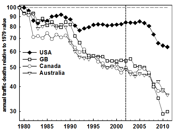
The post-2002 trend is examined in greater detail in Fig. 3. Rather than catching up on the 3 comparison countries, the US barely kept level with Canada and Australia, but fell yet sharply further behind Britain. Numerical values from Fig.1, Fig. 2, and Fig. 3 are presented in Table 2.
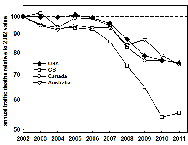
Table 2. Percent changes in fatalities in different periods for different countries. All can be derived from data in Table 1 (except that the Fig. 1 values are those plotted using the 2002 preliminary values[1]).
|
|
percent change in fatalities |
||||
|
|
2002
compared to 1979 |
|
2011
compared to 1979 |
|
2011
compared to 2002 |
|
United States |
-16.2% |
|
-36.7% |
|
-24.7% |
|
Great Britain |
-46.0% |
|
-70.1% |
|
-44.6% |
|
Canada |
-49.9% |
|
-62.0%b |
|
-23.8%b |
|
Australia |
-51.1% |
|
-63.7% |
|
-25.7% |
a Values are same as earlier analysis[1] using preliminary data then available – no material differences.
b Value for 2010.
A better safety measure
The above analyses were all based on selecting particular past years. The results are therefore dependant on what could be claimed is an arbitrary choice. Many prior analyses have been also performed using such rates as the number of fatalities per unit distance of travel, per registered vehicle, or per human population[1]. Every rate formed from these illuminates some aspect of safety, and each has its own interpretative or data deficiencies. For example, measures of distance of travel are unavailable or unreliable for most countries. It would be better to use a measure that does not depend on any source of data beyond the fatality data.
In the physical sciences, measures that are dimensionless are sought because of their many advantages. Even the simplest rate used in fatality analysis, the number of fatalities in each year, has the dimensions 'fatalities per unit of time' (or T-1) where the time unit is generally one year. A dimensionless measure that involved only traffic fatalities and no other assumptions would have advantages in safety analysis.
Such a measure can be defined because an industrialized country's traffic fatalities reach a maximum number, FMax. In the early days of motorization fatalities are low, then increase rapidly with industrialization, and eventually decline. It is apparent that the data for every country in Table 1 exhibit such a pattern. We can therefore define a measure for any industrialized country as:
Fatalities in year Y relative to max = 100 x (Fatalities in year Y) / FMax Eqn 1
Eqn 1 has other advantages. It does not depend much on the definition of fatality provided this remains the same for all years (it may not). Also, if a jurisdiction's data are systematically biased, this will also not affect results from Eqn. 1 provided the bias remains the same from year to year. This may not be true if data reporting is improved or if data is distorted to provide false indications of safety improvements.
Values of Eqn 1 are shown plotted for the US and the three comparison countries in Fig. 4. Plots for each country may have a different number of points because each country achieved its maximum number of fatalities in a different year, as given in Table 3.
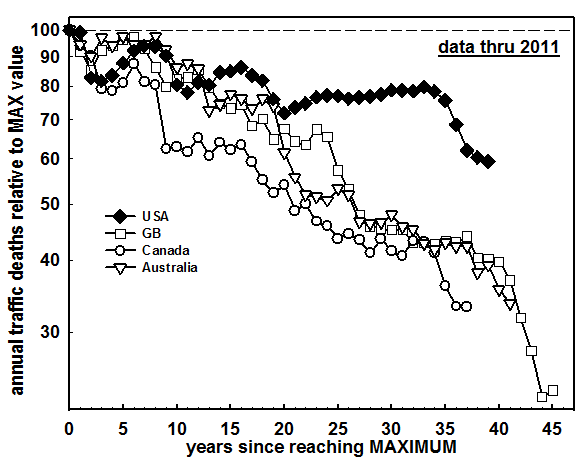
Table 3. Years in which countries experienced their greatest number of fatalities. All values are relative to 2011, except 2010 for Canada.
|
|
maximum
number |
|
occurred in |
|
number of years since maximum |
|
United States |
54,589 |
|
1972 |
|
39 |
|
Great Britain |
7,985 |
|
1966 |
|
45 |
|
Canada |
6,706 |
|
1973 |
|
37 |
|
Australia |
3,798 |
|
1970 |
|
41 |
The data as presented in Fig. 4 support the same conclusions as before. Indeed, Fig. 4 and Fig. 3 are remarkably similar even though their basis is different. US performance is dramatically worse than in the three comparison countries. The question still remains whether these three comparison countries had uniquely impressive performance, so that US performance might not have been such a dramatic failure claimed previously.[1]
Eqn. 1 provides an effective way to compare different countries. Figure 5 shows US and the three comparison countries compared to that in a number of other countries. These were selected to establish that many countries achieved larger reductions than the three comparison countries. Others, including Japan and Sweden, are not plotted because their data largely overlap with that of GB, the one of the original three comparison countries that attained the largest fatality reductions.
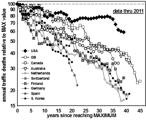
Figure 5 establishes clearly that the original three comparison countries were not uniquely successful. If other countries had been chosen, the measured difference between them and the US would have been even more dramatic.
Figure
6 shows all available fatality data for all 26 countries. This figure shows that
the fatalities in every one of the countries dropped further and/or faster from
their all time high than occurred in the US.
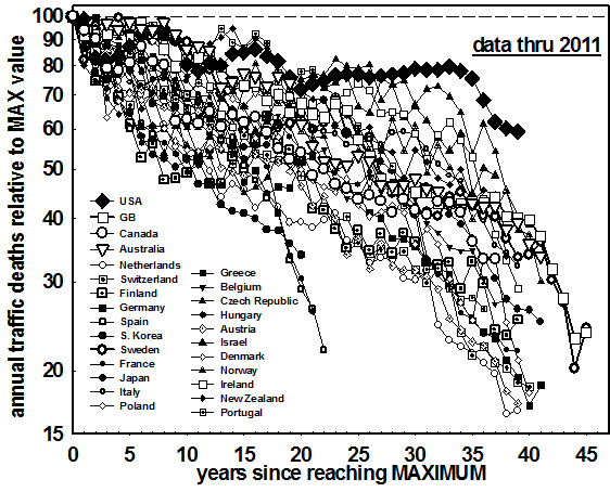
Figure 6.
Fatality reductions from their all time high in the USA compared to those
in all 25 other countries.
Fatalities in every one of the other 25 countries dropped further and/or faster
than in the US, showing that the US is a unique outlier.
An example – the US compared to the Netherlands
Numerical values used in Fig. 5 are given in Table 4 for the US and the Netherlands. Both countries experienced their maximum number of fatalities in 1972, so results can be interpreted as either progress since 1972 or progress since reaching their maximum number of fatalities.
Table 4. Fatality reductions in the US compared to reductions in the Netherlands, and estimated US fatalities if percent reduction in US had matched that in the Netherlands.
|
|
the Netherlands (NL) |
|
United States (US) |
|
year in which maximum fatalities occurred |
1972 |
|
1972 |
|
maximum number of fatalities |
3,264 |
|
54,589 |
|
number of fatalities |
546 |
|
32,367 |
|
percent reduction, |
83.3% |
|
(40.7)%* |
|
estimated fatalities if 83.3% decline from maximum |
(546)* |
|
9,132 |
|
additional US fatalities
by failing |
|
|
23,235 |
*These values do not contribute to calculating the bottom line estimate
In the 39 years from 1972 to 2011 US fatalities declined by 40.7%. Taken in isolation this might seem an impressive improvement. Indeed, such progress is often lauded in the US. However, in the same period fatalities in the Netherlands declined by 83.3%. If US fatalities had declined by that same 83.3%, then in 2011 US fatalities would have been 9,132, and not the 32,367 observed. In other words, because the US failed to match the decline in the Netherlands, an additional 23,235 deaths occurred on US roads.
The same calculation was applied to comparing the US to each of the other 25 countries. Every one of them had declined from their all time high by more than had the US. The average result for all 25 countries was 16,414 additional American deaths in 2011. In addition to the Netherlands, six other countries (Austria, Denmark, France, Germany, Spain, and Switzerland) produced the result that if the US had matched their declines since reaching their maximum, then US fatalities in 2011 would have been more than 20,000 fewer than occurred.
Other measures
The central focus of this paper is the above comparison of reductions in fatalities for different countries from their all time high. Below we examine how the above findings relate to two more traditional measures.
Driver fatalities per thousand registered vehicles
The IRTAD data [6] contains estimates of the number of registered vehicles in each jurisdiction. Information of this type is assembled because tax must be paid on most vehicles. Reporting is far from uniform. Some countries include only cars (vehicles designed to provide transportation for a driver and a number of passengers), treating trucks and busses as different entities. Two-wheel vehicles are often handled differently. If similar definitions apply for year after year, even large differences in what is included as a 'vehicle' will not have a major effect on results here provided the same proportions remain unchanged over time (unlikely to be more than a rough approximation). The US procedure to count every vehicle with an engine that has been in effect since the early days of motorization, and is the one I recommend.
We examine first the comparison between the US and the original three comparison countries, as shown in Figure 7. This figure extends the time series in the figure on page 384 of Ref. [1] through 2011 compared to the earlier 2002.
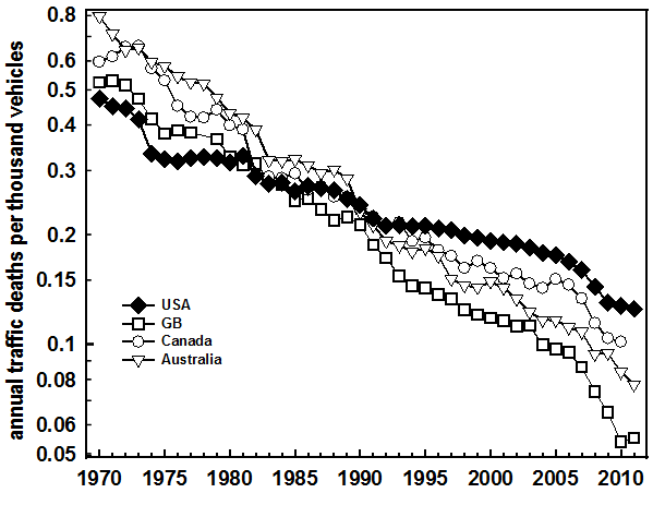
Figure 7.
Fatalities per thousand registered vehicles for the US compared to that
for the original 3 comparison countries.
Six
additional countries are added in Fig. 8. All had higher rates than the US in
the 1970s, but by 2011 all had reduced their rates to well below the US level.
The one exception in Fig. 8 is S. Korea, which enjoyed a rapid reduction from a
very high level from the years when data were first collected.
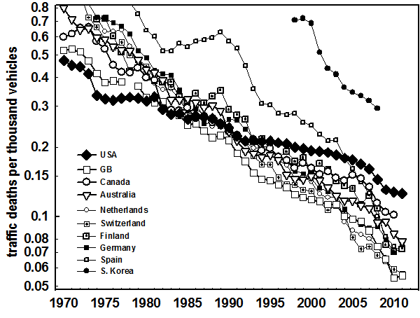
The
data for all 26 countries are plotted in Fig. 9. While it is of course not
possible to follow the data for the individual countries, some clear conclusions
nonetheless follow.
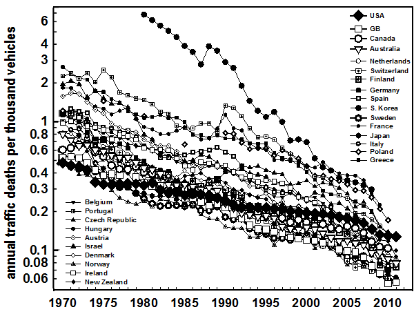
Figure 9. Fatalities per thousand registered vehicles for the US compared to that for all other 25 countries.
1. In the 1970s all 25 countries had rates higher than the US. The US, as was often heralded at the time[9], had the safest traffic in the world.
2. By 2011 the US had dropped from number one in safety to number 18. The 17 countries (not all readily readable from graph) with rates lower than the US were: Australia, Austria, Canada, Denmark, Finland, France, Germany, Great Britain, Ireland, Italy, Japan, Netherlands, New Zealand, Norway, Spain, Sweden, and Switzerland.
3. The overall pattern is of the US rate declining at a lower, in many cases, much lower, rate than each the other 25 countries.
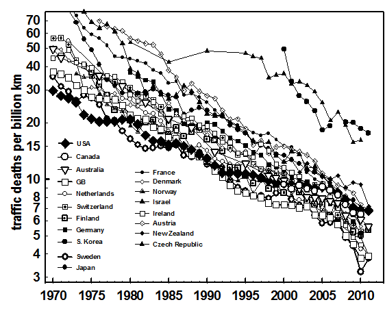
Driver fatalities per billion km of vehicle travel
Another measure that has much intuitive appeal is the number of traffic deaths for the same distance of vehicle travel. Unlike vehicle registrations, which are efficiently tabulated by governments in order to collect taxes, the distance travelled by all the vehicles in a nation can be determined only if there is a effort aimed to achieve this. The most reliable data are from GB, which has a long time commitment to estimating total national travel. Britain currently obtains estimates mainly based on around 10,000 manual counts, where trained enumerators count traffic by vehicle type over a 12 hour period.[10]. Estimates of total travel in the US are based on estimates from the individual states. No recipe is available on how each state arrives at such estimates. Changes over time, which are the chief interest in this paper, should be more reliable than absolute accuracy.
The
only comparison in Ref. 1 based on fatalities for the same distance of travel
was between the US and GB, as given in the figure on p. 388 of Ref. 1. This is
extended through 2011in Fig. 10, which includes also estimates for the other two
comparison countries, Australia and Canada. The Australian data is sporadic, at
times reported only at 5-year intervals. The Canadian estimates are available
only for 2000 through 2010. All three comparison countries have lower rates than
the US for the most recent data. The only two (GB and Canada) with data from the
1970s had higher rates then.

Of
the 26 countries studies, 19 had estimates of some sort for distance of travel
in the IRTAD data[6]. The rates for these are shown in Fig. 11. The impression
is inescapable that the rates for all the countries are declining faster than is
so for the US. In the 1970s no country had a lower rate than the US. Now the US
has dropped from best in the world to being ranked number 13. The 12 countries
with rates lower than the US are Australia, Canada, Denmark, Finland, Germany,
Great Britain, Ireland, Israel, Netherlands, Norway, Sweden, and Switzerland.
CONCLUSIONS
The answers to the three questions posed is in all cases a definitive 'yes'. The fatality rates examined all declined in the US over the last four decades. However, they declined more rapidly in each of the other 25 countries, in most cases far more rapidly. In terms of declines after reaching a maximum number of fatalities, the US is a unique outlier. All 25 other countries declined further or faster. The US was the safest country in the world in the 1970s. By 2011 the US dropped from number one to number 18 in terms of driver fatalities per thousand registered vehicles, and from number one to number 13 in terms of driver fatalities per billion km of vehicle travel.
The failure of US safety performance is of near incomprehensible magnitude. Between 1972 and 2011 traffic deaths in the Netherlands dropped by 83.3%. If deaths in the US had dropped by the same percent, more than 20,000 fewer Americans would have been killed in 2011. This result is not just for the Netherlands. If the US had matched the percent declines of 6 other countries, the same result applies – 20,000 fewer dead Americans per year.
While the magnitude of the dramatic failure of US safety policy is even greater than found in Ref [1], the reasons for the failure remain as described there.
REFERENCES
1. Evans L. Traffic Safety. Bloomfield Hills, MI, USA: Science Serving Society, 2004
2. Eisenberg, D. Book review Traffic Safety by L. Evans. J Am Medical Assoc 294 2005;746–747
3. Department for Transport. Transport statistics, Table 9.10. Road accidents and casualties: 1950-2002
4. Transport Canada. Canadian motor vehicle traffic collision statistics: 2002
5. Australian Transport Safety Bureau. 2002
6 www.irtad.net (accessed 2013-06-20).
7.
Personal communication via email from Niels Bos, Department Road Safety
Assessment, SWOV Institute for Road Safety Research, The Netherlands,
2013-03-05
8. Hauer, E. The reign of ignorance in road safety: A case for separating evaluation from implementation. In: Moses LN (Ed), Savage I: Transportation safety in an age of deregulation, Oxford University Press, USA.1989;56-69
9. U.S. the safest place for driving. Motor Vehicle Manufacturers Association of the United States. MVMA Facts and Figures (p 52), 1981. Detroit, MI; 1981
10. Department of Transport, Transport Statistics, Notes and Guidance: Road traffic https://www.gov.uk/government/uploads/system/uploads/attachment_data/file/49976/annual-methodology-note.pdf, accessed 2013-06-24